/ by jthomas29
My Role
Web Designer, Web Developer, UX Design
Tools Used
Photoshop, Figma, WordPress, Google Docs
The Process
Graphic Design, User Flows, Wireframes, Web Development
The Problem
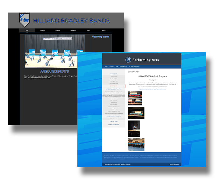
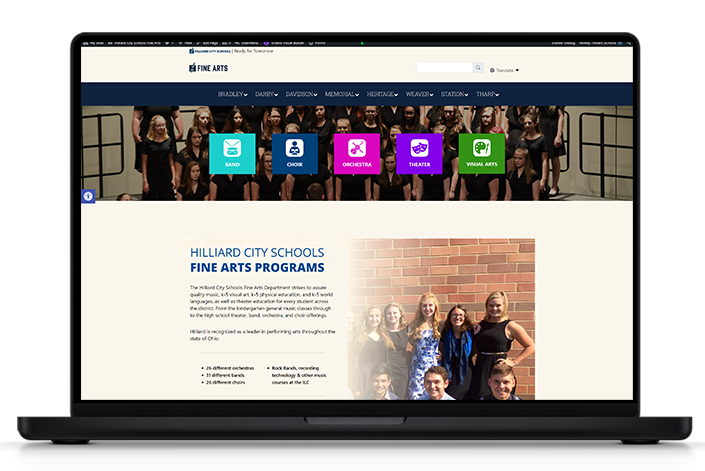
The Hilliard City School District’s Fine Arts resources were previously fragmented across various websites, applications, and forms, creating a disjointed experience for users and complicating management. This scattered structure made it challenging for staff, students, and parents to easily access important information, complete forms, and utilize key tools.
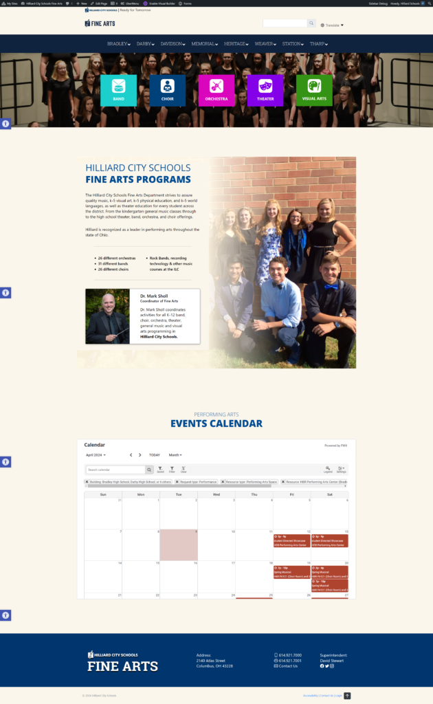
To address these issues, the district aimed to unify all Fine Arts resources into a single, cohesive platform. By centralizing everything under one user-friendly system, the district sought to streamline navigation, improve accessibility, and ensure efficient management for all stakeholders.
This integrated solution not only simplifies day-to-day tasks but also enhances the overall experience for users, making information and resources more accessible and easier to maintain.
Sitemap
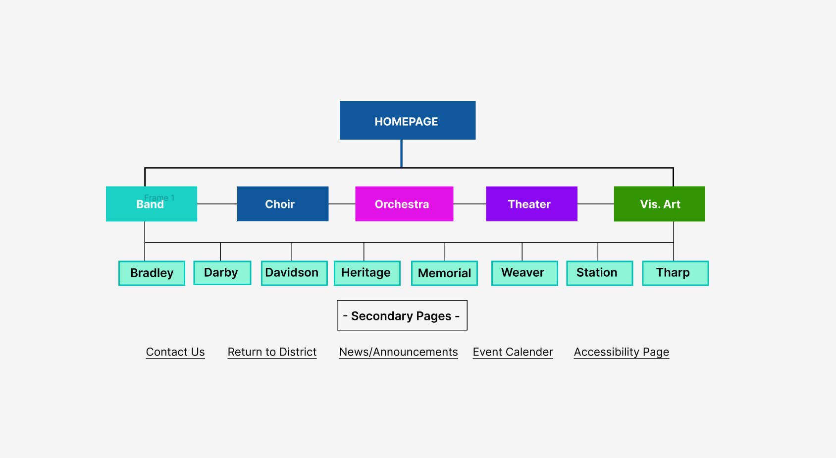
1. Mapping Existing Content: The first step was to gather and evaluate all the content, resources, and tools scattered across the various websites, applications, and forms. By building a comprehensive sitemap, we could visualize the full structure of the current digital landscape, identifying redundancies, outdated content, and areas that required consolidation.
2. Defining Core User Journeys: Once the content was mapped, we analyzed the most common user flows for different groups (students, parents, staff) to ensure the new site would meet their needs efficiently. The sitemap helped define clear pathways for these core users, ensuring they could access essential information and tools with minimal clicks.
3. Organizing Content Hierarchically: The sitemap allowed us to reorganize content logically, grouping related resources and forms under intuitive categories. This hierarchical structure created a cleaner navigation system, reducing complexity and helping users find what they need more quickly.
4.Guiding Design and Development: The sitemap served as a blueprint for both the design and development teams, guiding the layout and functionality of the new unified website. It provided a clear structure for organizing pages, menus, and links, ensuring consistency and ease of use across the entire site.
By leveraging the sitemap as a foundational tool, the new Fine Arts website became a more cohesive, intuitive, and efficient platform, greatly enhancing user experience and making it easier to manage for the district.
Wireframe
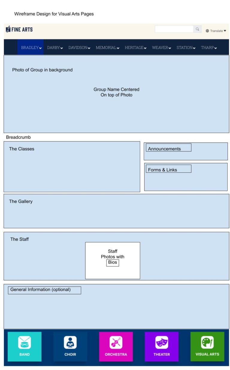
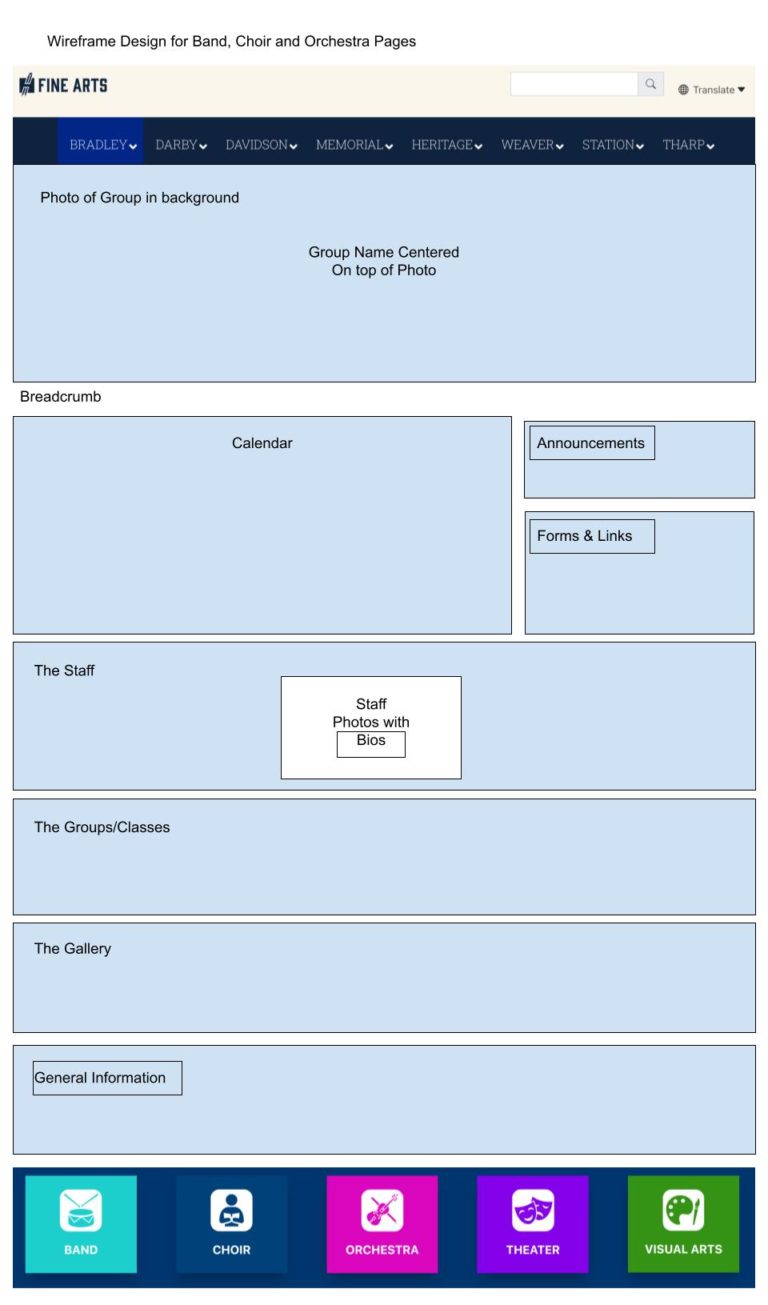
Wireframes played a key role in organizing the structure and functionality of the Hilliard City School District’s Fine Arts website, ensuring that each program and landing page was easy to navigate and user-friendly. For each Fine Arts program (e.g., Music, Visual Arts, and Theater), wireframes established a consistent layout, outlining where key content—like program descriptions and events—would appear. This ensured that users could easily find the most relevant information across all programs.
Landing pages, serving as gateways to more detailed content, were designed through wireframes to highlight high-priority information, such as upcoming events or announcements, at the top of the page. The wireframes helped maintain a clear visual hierarchy, with strategically placed buttons and links to guide users through the site efficiently. They also accounted for mobile responsiveness, ensuring the pages were easy to navigate across different devices.
Balancing text and multimedia was another focus. Wireframes specified the placement of photos, videos, and galleries to complement program content without overwhelming users. Modular content blocks ensured that updates could be made easily, keeping the site dynamic without requiring extensive redesigns.
Wireframes also facilitated feedback from stakeholders—such as teachers, administrators, and students—during the design process. Their low-fidelity nature made it easy to gather input on content prioritization and ease of use, allowing adjustments before moving to full design and development.
Website Features
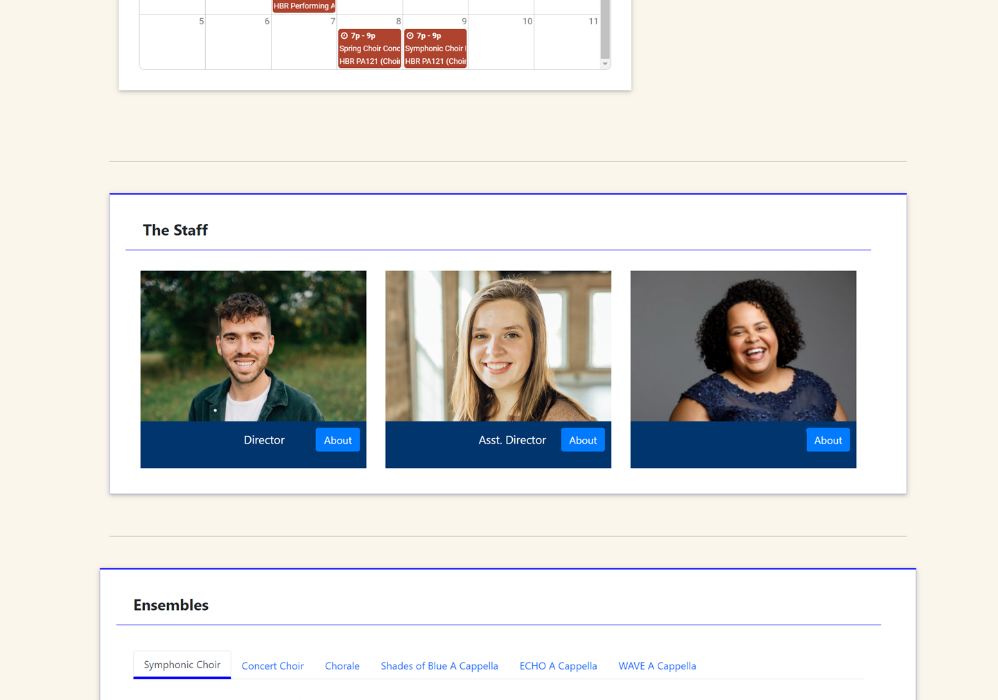
Schedule Calendar & Forms/Announcements Sections
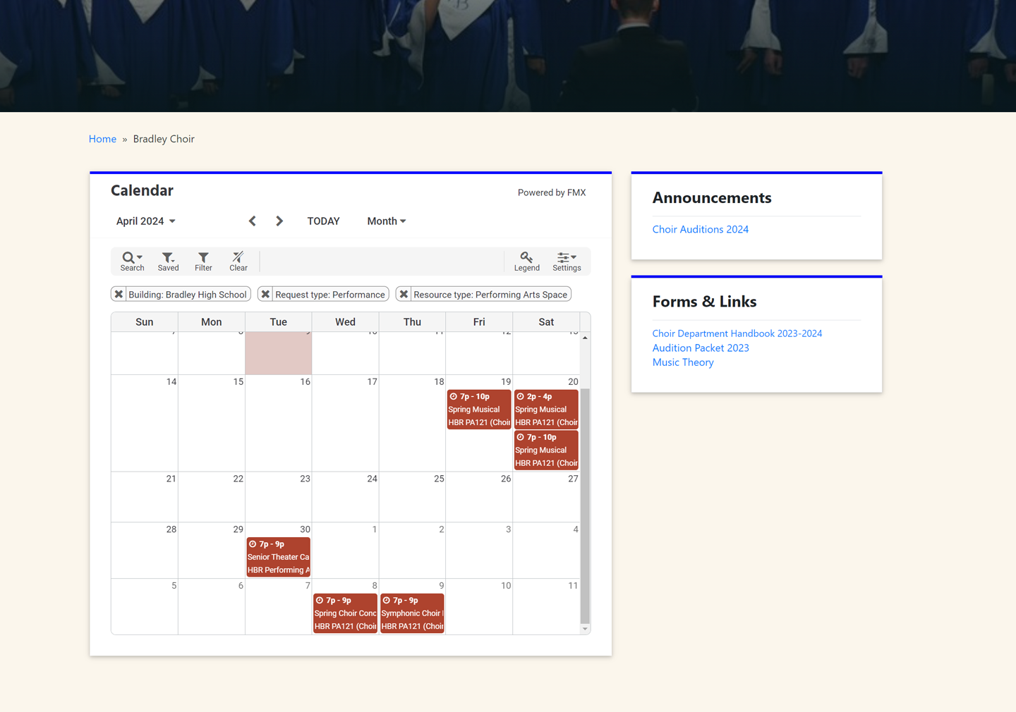
To enhance functionality, we integrated 3rd party software to add a Schedule Calendar, which provides a centralized view of all events, performances, and rehearsals. This calendar allows students, parents, and staff to easily track important dates and stay updated on upcoming Fine Arts activities in one convenient place.
Additionally, we introduced Announcements and Forms sections, creating an organized template for crucial documents and updates.
This structure simplifies access to important information, such as announcements, deadlines, and required forms, ensuring that parents and students can quickly find what they need without navigating through multiple pages.
These features contribute to a streamlined, user-friendly experience.
The Staff Profiles
We also added a Current Staff Roster for each Fine Arts program, featuring the names, contact information, building phone numbers, and email addresses of faculty members.
This centralized directory makes it easy for students, parents, and staff to quickly find and connect with the appropriate faculty member.
By providing this accessible contact information, the feature effectively solves the issue of communication barriers, ensuring a more open and efficient line of communication between faculty, students, and parents. This not only improves collaboration but also supports a more responsive and connected community.
The Programs
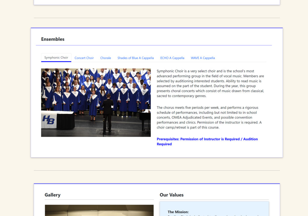
Each program page includes detailed information about the various classes and programs, outlining the specific requirements and prerequisites that students must meet.
This ensures that students and parents have a clear understanding of what is needed to participate in each course or activity, from necessary skills to prior coursework.
By presenting this information upfront, the site helps students make informed decisions about which programs to pursue, while also reducing confusion about eligibility. This clear structure aids in course planning and ensures that everyone has the necessary details to successfully engage in the Fine Arts offerings.
Reflections
Overall, we are pleased with the results of consolidating over 12 different websites, pages, and external resources into a single, unified platform. This effort required significant collaboration and dedication, but it has ultimately created a more organized and user-friendly experience for students, parents, and staff.
The streamlined website not only enhances accessibility to essential information but also fosters better communication and engagement within the Fine Arts community.
We believe that this comprehensive approach will lead to greater involvement and success for all participants in our programs.
Visit Site
