Graphic Design Web Design Web Development WordPress
/ by jthomas29
The Problem
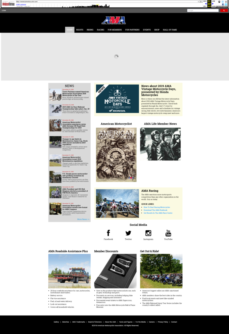
The website was originally built using the DNN Content Management System, which posed challenges in managing and maintaining content over an extended period. The complexities of the platform made it cumbersome for staff to update information and keep the site current.
As business requirements evolved, we recognized the need for a more user-friendly solution that would simplify content management.
To address these challenges, we opted for a new system that not only streamlined website content management but also enhanced the membership system and facilitated the publishing of the digital magazine.
This transition has enabled a more efficient workflow, making it easier for staff to maintain up-to-date information and engage effectively with the community.
My Role
Web Designer, Web Developer, UX Design
Tools Used
Adobe Photoshop, Illustrator, WordPress
The Process
Graphic Design – User Flows – Wireframes
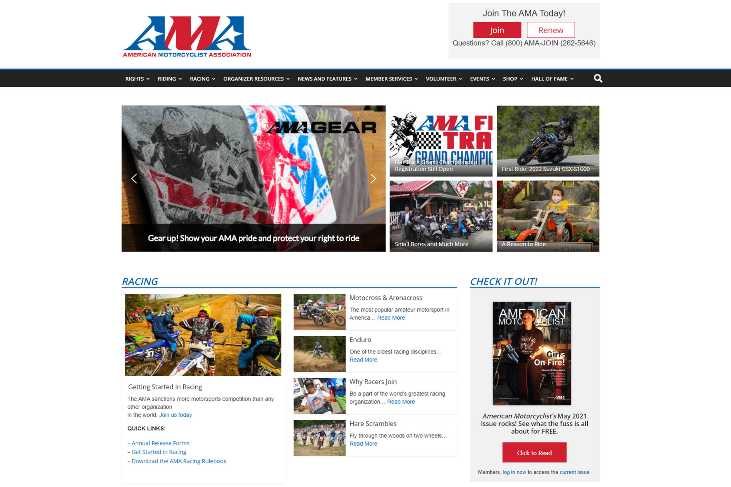
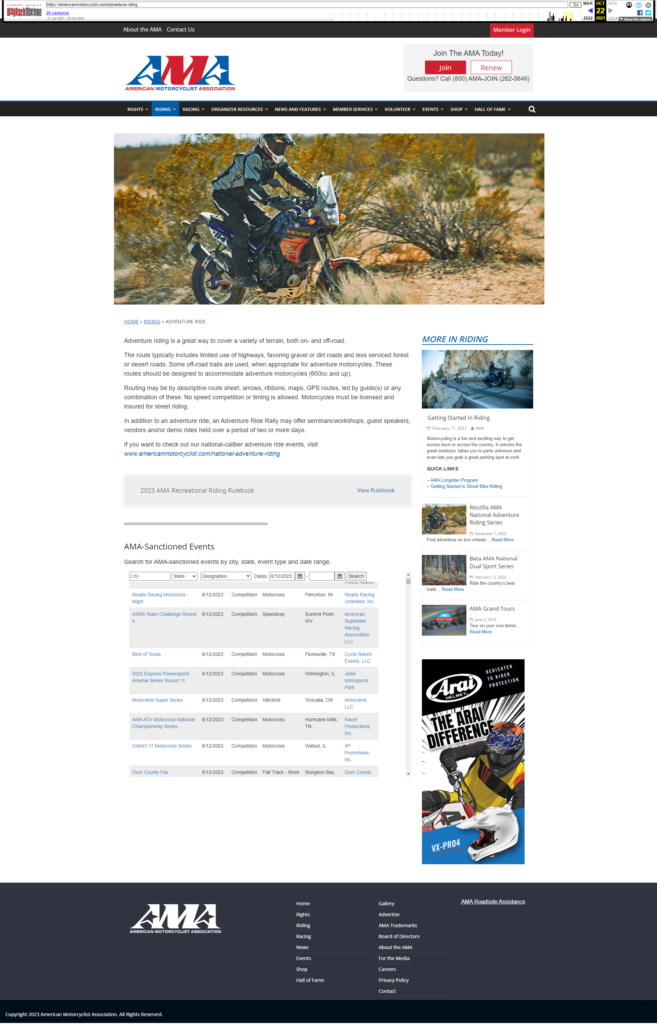
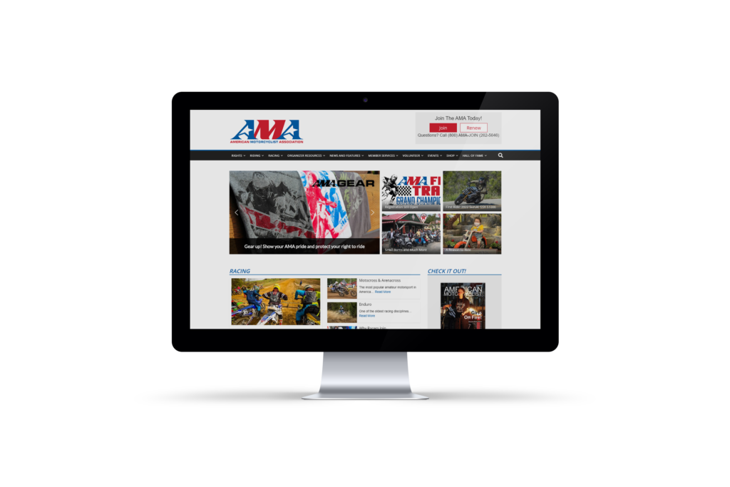
For the American Motorcyclist Association (AMA) website, we focused on creating a user-friendly, engaging platform that would appeal to both current members and potential new users. Starting with the home page, we designed a full-width hero banner to showcase the vibrancy of the motorcycle community, highlighting key events and advocacy campaigns. We included clear CTA buttons like “Join Now” and “Support AMA” to encourage action. A news slider was added to keep users informed of the latest updates, and we placed quick links to important sections like membership benefits and racing events for easy navigation.
The navigation itself was made as straightforward as possible. We created a sticky top menu with key categories such as About AMA, Membership, Racing & Events, and Advocacy to ensure users can easily find what they’re looking for at any point. We also integrated a search bar in a prominent position to facilitate quick access to specific content. On the accessibility front, we prioritized a fully responsive design, ensuring the site looks great on mobile devices and desktops alike. Features like high-contrast mode and text resizing options were added to make the site inclusive for all users.
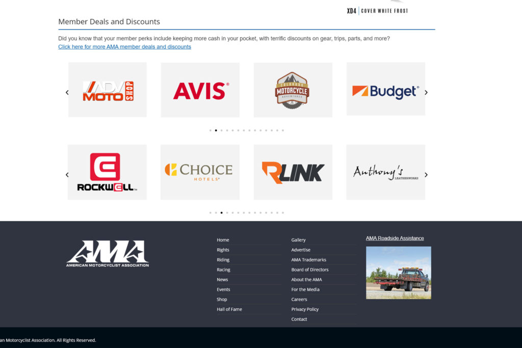
For the Membership page, we streamlined the presentation of membership tiers, using clear comparison charts and highlighting the benefits of joining AMA. Testimonials from satisfied members were also added to build trust and show the value of membership. We kept a sticky “Join Now” button visible throughout the page to make signing up simple and accessible. This was all aimed at making it easy for visitors to understand the benefits and take action.
The Racing & Events section is a major draw for AMA members, so we created an interactive, filterable calendar that allows users to find events by location, date, and type.
Each event now has a dedicated page with detailed information such as schedules, registration details, and live updates during the race. This gives users everything they need to get involved and stay engaged with upcoming events.
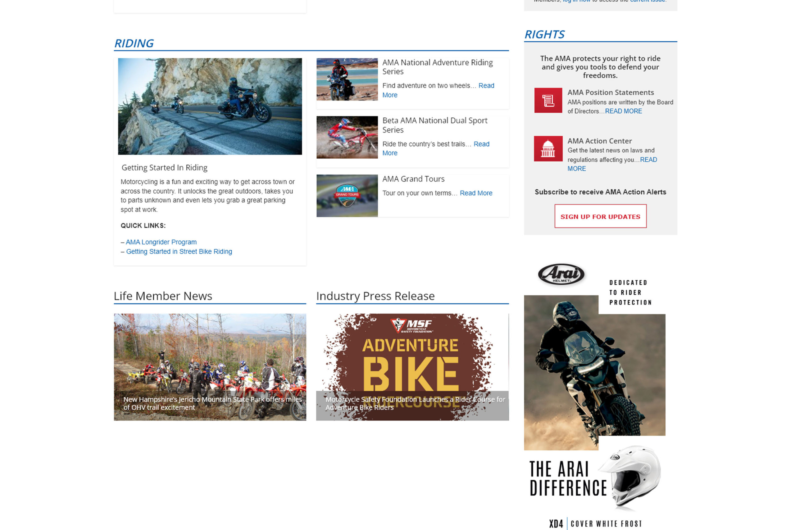
In the Advocacy section, we wanted to highlight AMA’s efforts in a way that inspires action. We showcased current campaigns and gave users clear ways to get involved, such as contacting their legislators. This section also includes a resource hub where users can download guides on safety and legislative issues, ensuring they’re well-informed and able to participate in advocacy efforts.
Finally, we improved the Clubs & Community section by adding a club locator tool, allowing members to easily find local AMA-chartered clubs. We also built a community forum where members can connect, share stories, and organize rides. Additionally, we introduced a Member Dashboard, giving logged-in users an easy way to manage their profiles, track their event registrations, and view their membership benefits in one place.
Overall, the focus was on enhancing user experience, driving membership growth, and promoting AMA’s key initiatives, while making the site accessible and enjoyable for all visitors.

